INTRODUCTION
Landing Page Examples
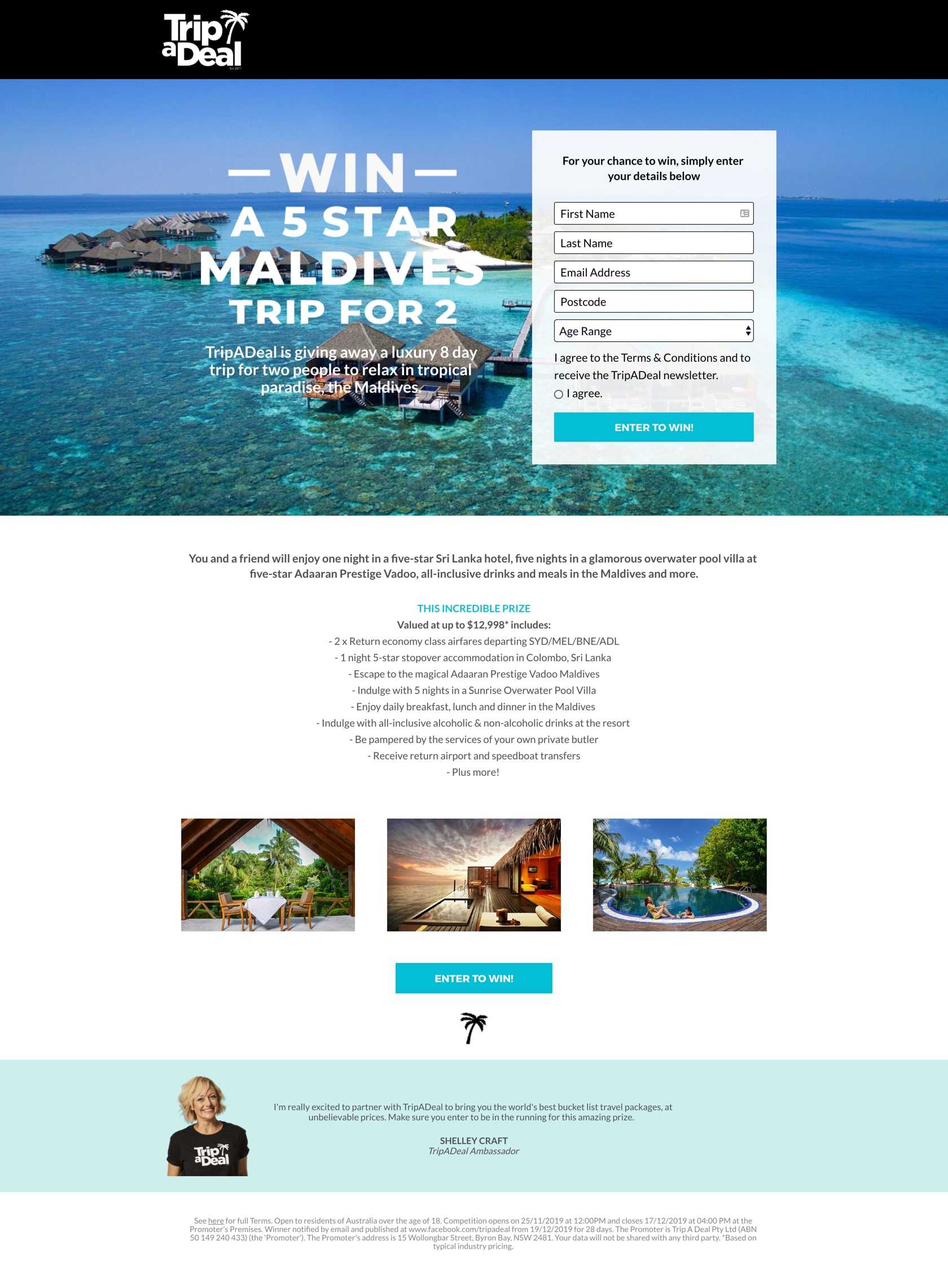
Contest Landing Page Example from TripADeal
Take flight with this US$13K giveaway
A strong headline highlights what visitors will get when they join the giveaway, bullet points are optimized to help visitors scan the prize, high-quality images show visitors how the trip to Maldives will look like – this landing page can’t be more compelling.
A clear and compelling offer. This landing page tells visitors exactly what they’ll get when they enter their names and email addresses. The information about the offer is shown in bullet points, which makes it easy for visitors to scan the prize.The call-to-action button is simple, short, and direct. It is also placed above the fold so visitors can quickly take action.Proper page length for the offer. The prize is attractive enough to possibly make visitors opt in. So, it doesn’t need to be too long.
The copy should be left-aligned. It is currently center-aligned, which makes it more difficult to read than it needs to be.
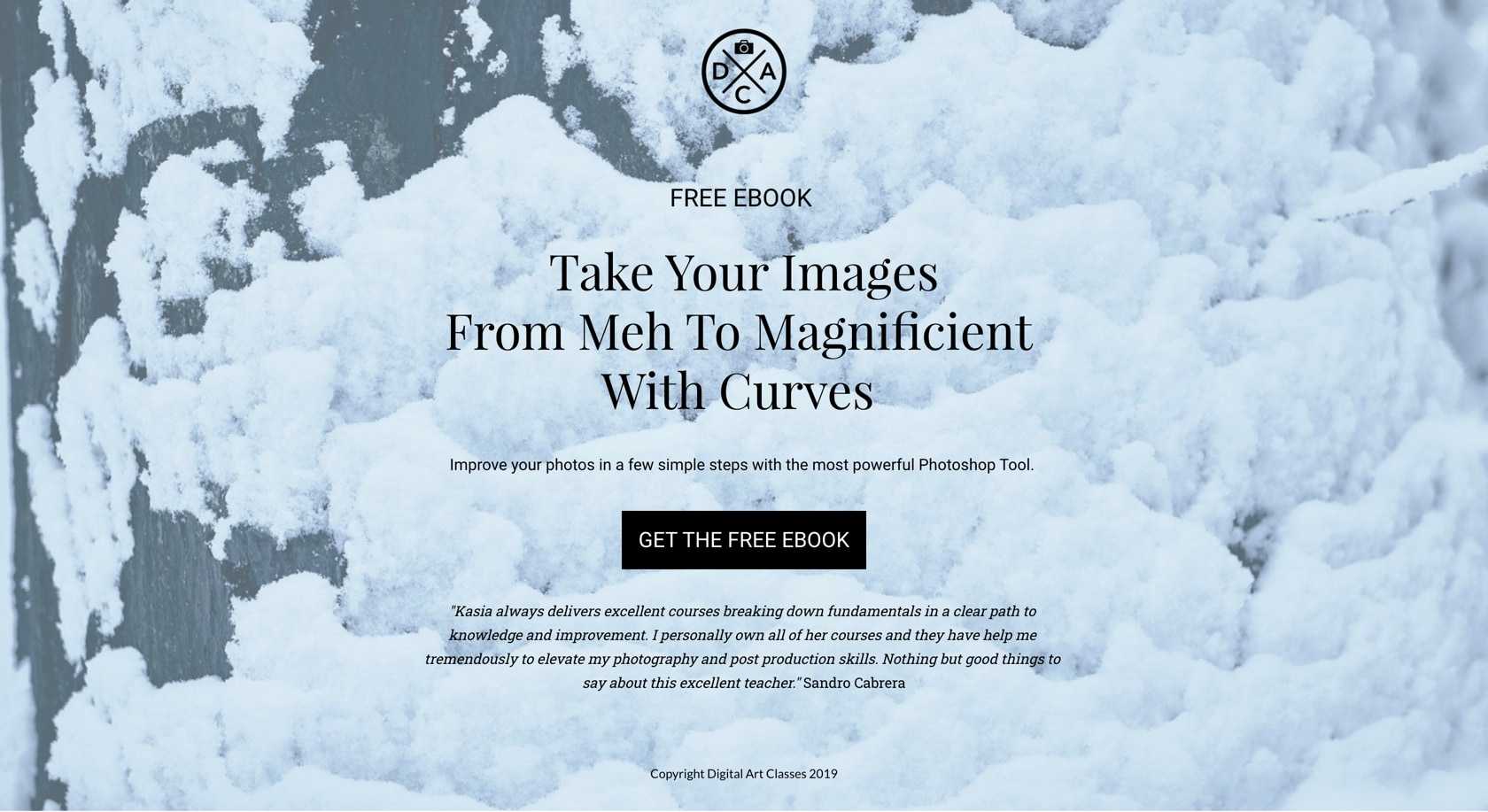
eBook Opt-in Page Example from Digital Art Classes
Offering a photography ebook to get more leads
A free ebook is a credible online marketing lead magnet, which helps generate valuable leads and communicate knowledge to visitors. By creating a compelling landing page for your ebook, your visitors will feel more convinced to download it.
Benefit-oriented headline. The headline communicates a strong benefit. The subheadline mentions Photoshop, a well-known photo editing tool with photographers and photo editors, which makes the benefit clearer. Optimized powerful words. The word ""free"" is used in the headline and the call-to-action button (Who doesn’t love free stuff?). Also, this landing page uses verbs (learn, get, discover) rather than nouns (tips, workshop, ebook), which is effective to motivate visitors to take action.
The image of an ebook mock-up should be included. The current background image is a bit vague and may not be relevant to the offer. It’s much better if visitors can have a preview of what they’ll get.
Event Page from SweetLife
Collecting registrations for an online event
Collecting registrations for an online event
Only 2 form fields – asking simply for name and email – is quick and easy to complete. Two countdown timers that create a sense of urgency. This motivates visitors to reserve their seats before the event ends. The words ""Free"" and ""No cost"" in the subheadlines are capitalized, making the event more compelling. Show a picture of the host, so visitors can know who is organizing the event. Offer free gifts with detailed information, so visitors can’t say anything but ""yes"" to the event.
Add additional lines to let visitors know that even if they can’t attend the event, they can still sign up to receive a recording of it and free gifts. Including reviews or testimonials can help increase trust in prospects, and so improve conversion rates. Change the top background image to another which is more relevant to the event topic.
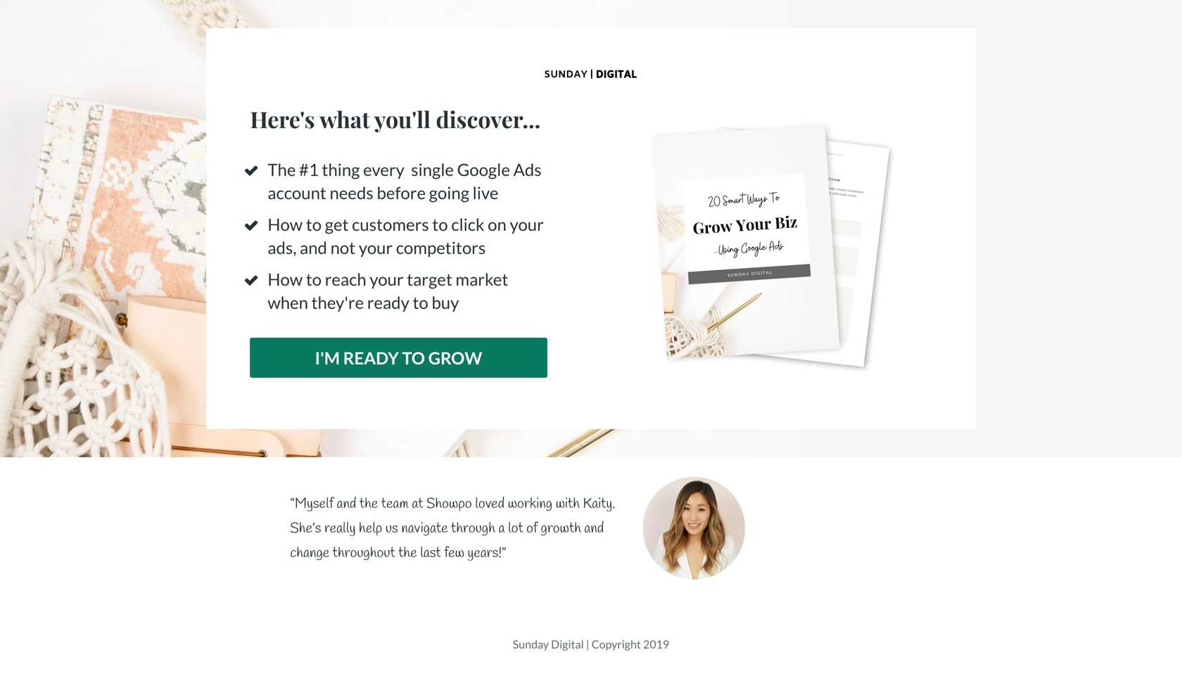
eBook Opt-in Page Example from Sunday Digital
Generating leads with an ebook giveaway
Creating a landing page is a good way to turn your ebook into an effective lead generation tool. By doing that, you can tell customers that your ebook is a must-read and also the solution to their problems.
Bulleted copy quickly communicates the benefits of converting on this page. Starting bullet points with ""How to"" conveys a clear benefit to visitors. The color of the call to action (CTA) button contrasts the rest of the page well. The CTA is written in the first person: "I’m ready to grow" instead of "Ready to grow?" A testimonial along with a photo of the customer who gave that testimonial helps build trust with visitors.
Make the offer clearer. Is it an ebook? A checklist? A resource guide? A cheatsheet? Visitors want to know exactly what they’ll get from you. Don’t make they think. The background image is confusing considering the ebook is about improving the performance of Google Ads campaigns. A/B test different CTA copy, for example, "Get my free checklist", "Download now".
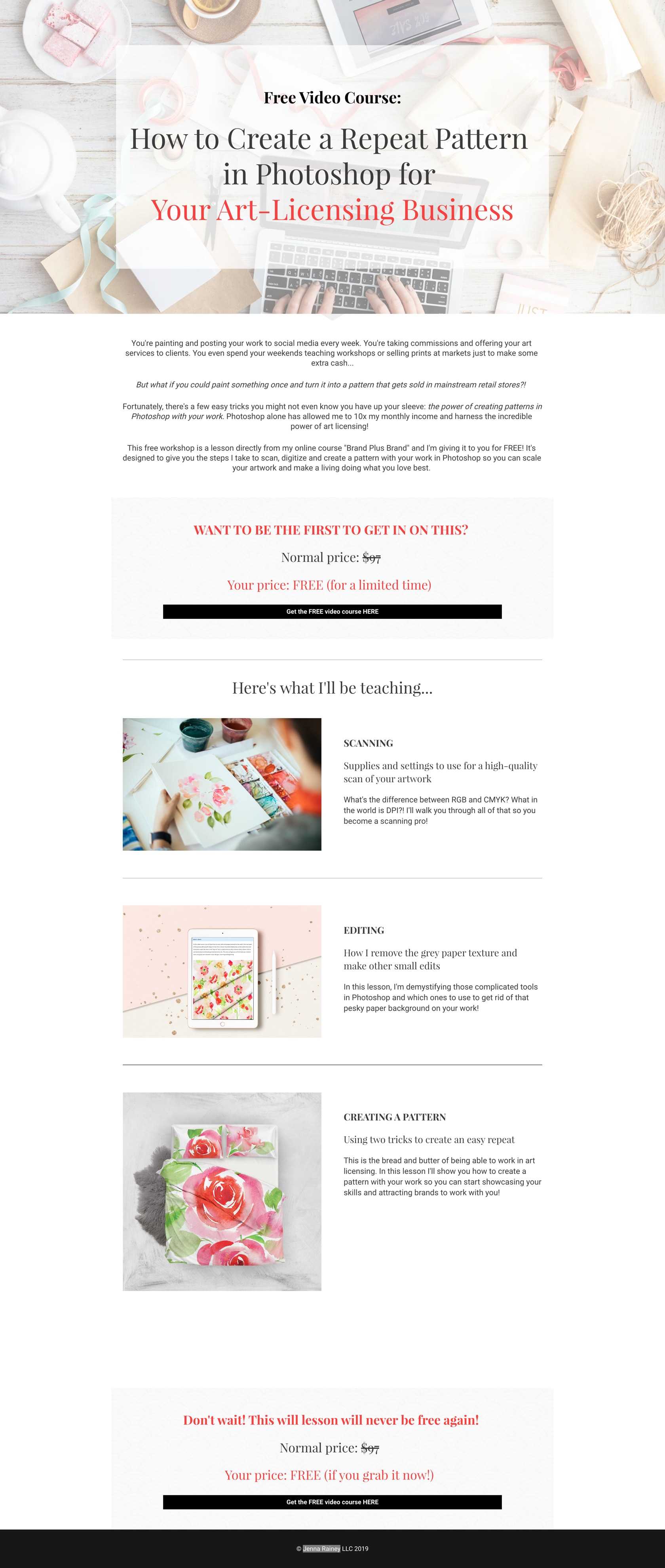
Video Course Landing Page Example from Jenna Rainey
Giving away free training to gain a qualified lead
Visitors now prefer watching demonstration videos rather than reading an ebook with a lot of text. You can turn your video course into a compelling landing page to convince visitors to leave their email and join your course.
The headline is clear and straightforward, which tells visitors what they’ll learn from the video course. "Free" is used in several locations on the page – in the headline, on the call to action buttons, and many times throughout the descriptive copy - to let prospects know the video course is free to access. Showing a strikethrough price helps attract the attention of visitors. The background image is consistent with the offer.
Although two CTA buttons were used, they are too small, which makes them easy to be missed. Also, their colors could be changed to call more attention. Write a shorter CTA copy and/or use the first person, for example, "Get my free video course", "Take the video course".
Giveaway Landing Page Example from Evision Festival
Running a giveaway contest to collect leads
It’s always a smart strategy to create a landing page for a contest. Tell visitors what you offer, how they can enter the giveaway, and when it ends – remember to make your contest as easy to join as possible.
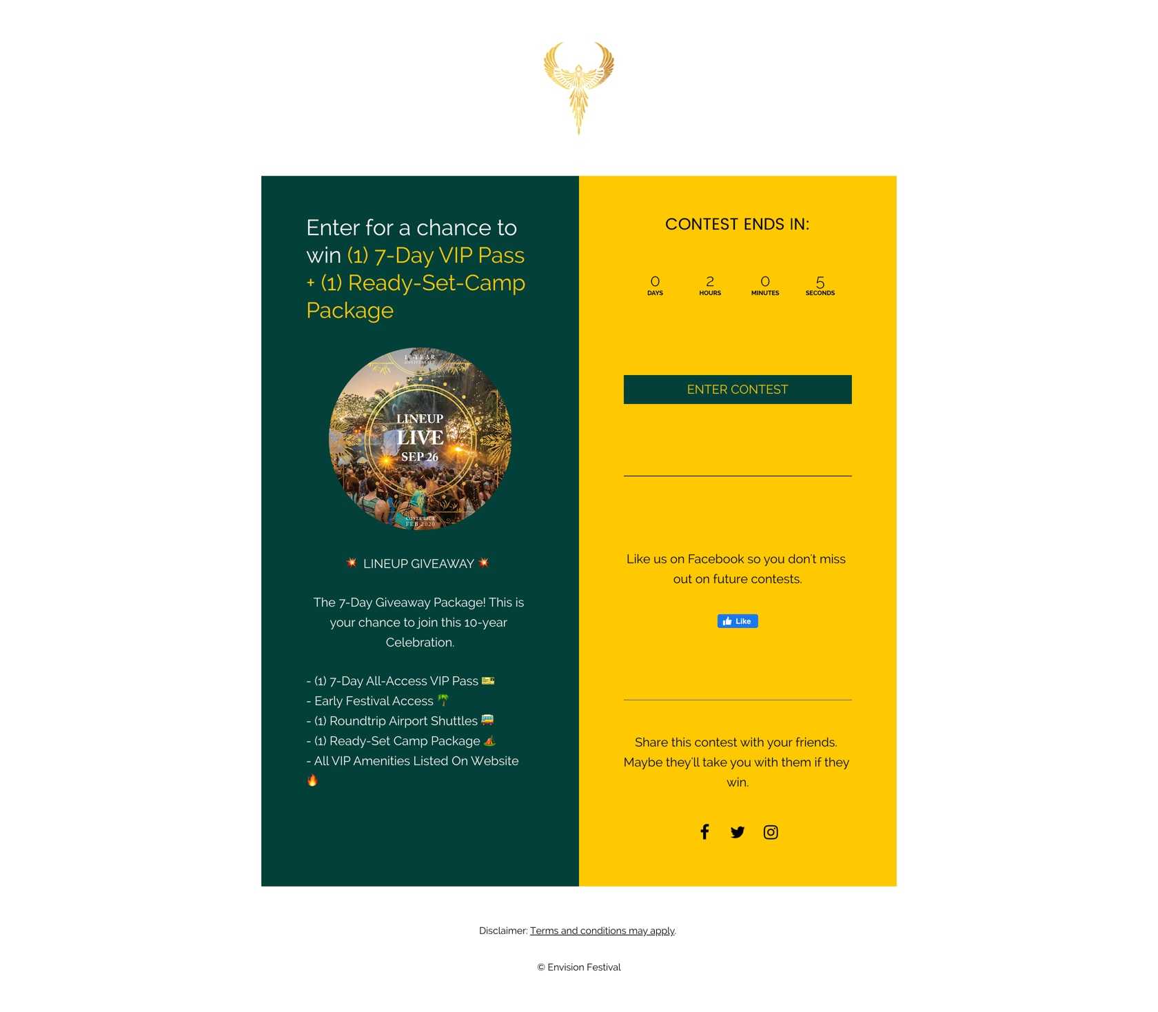
The design follows the principle "less is more". The image is very relevant to the headline. Using a countdown timer provides some urgency to push visitors to take action now. The call to action button is short and sweet. Bullet points are used to showcase the benefits of joining the contest. Visitors know exactly what’s inside the package, so they can make a quick decision whether to join or not.
Many outbound links, including Facebook, Twitter, and Instagram buttons, distract visitors from entering the contest. The yellow CTA button doesn’t contrast with the background as much as it could.
Newsletter Signup Landing Page Example from Bucketlist Bombshells
Generating leads with an email opt-in form
How about a dedicated landing page for your email marketing list? It’s a smart tactic to do because you can make use of all conversion optimization techniques to get more leads and increase potential purchases.
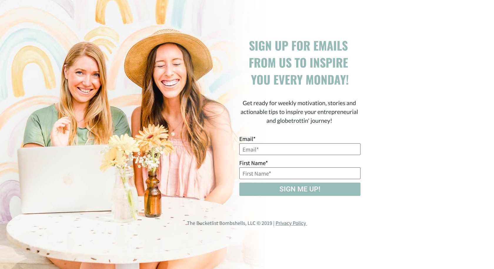
The headline and subheadline work together to form a strong value proposition. The headline states clearly what visitors need to do while the subheadline gives detailed information on what they’ll get after that. There are only two form fields (email and first name), which is really good. The call to action button is short and uses the first person. The background image is relevant to the offer.
A/B test different CTA copy, for example, "Let me in", "Inspire me". Show some reviews or testimonials to create trust with visitors.
Video Course Landing Page Example from the Journey Junkie
Connecting with prospects through an online challenge
Design a video course landing page to build a connection with visitors, share with them useful information and solutions to their problems, and finally, turn them into converting customers. Doing this is an effective way to increase your sales.
The call to action (CTA) button is placed above the fold, making it noticeable. The first part of the headline asks a question that prospects have and the second part (and the following copy) offers the answer. By speaking directly to visitors, the headline helps engage them. Two cooperative CTAs help convert prospects in two different places on the page. Showing information about the teacher helps visitors know who will train them.
Take advantage of social proof such as reviews or testimonials to build trust with visitors. Create a sense of urgency by showing a countdown timer.
Event Ticket Landing Page Example from Semana Dev Ops
Increasing online event registrations
Is there any better way to compel visitors to join an event now than by creating a beautifully designed event landing page? No doubt event landing pages are a great way to drive registrants or post-click actions.
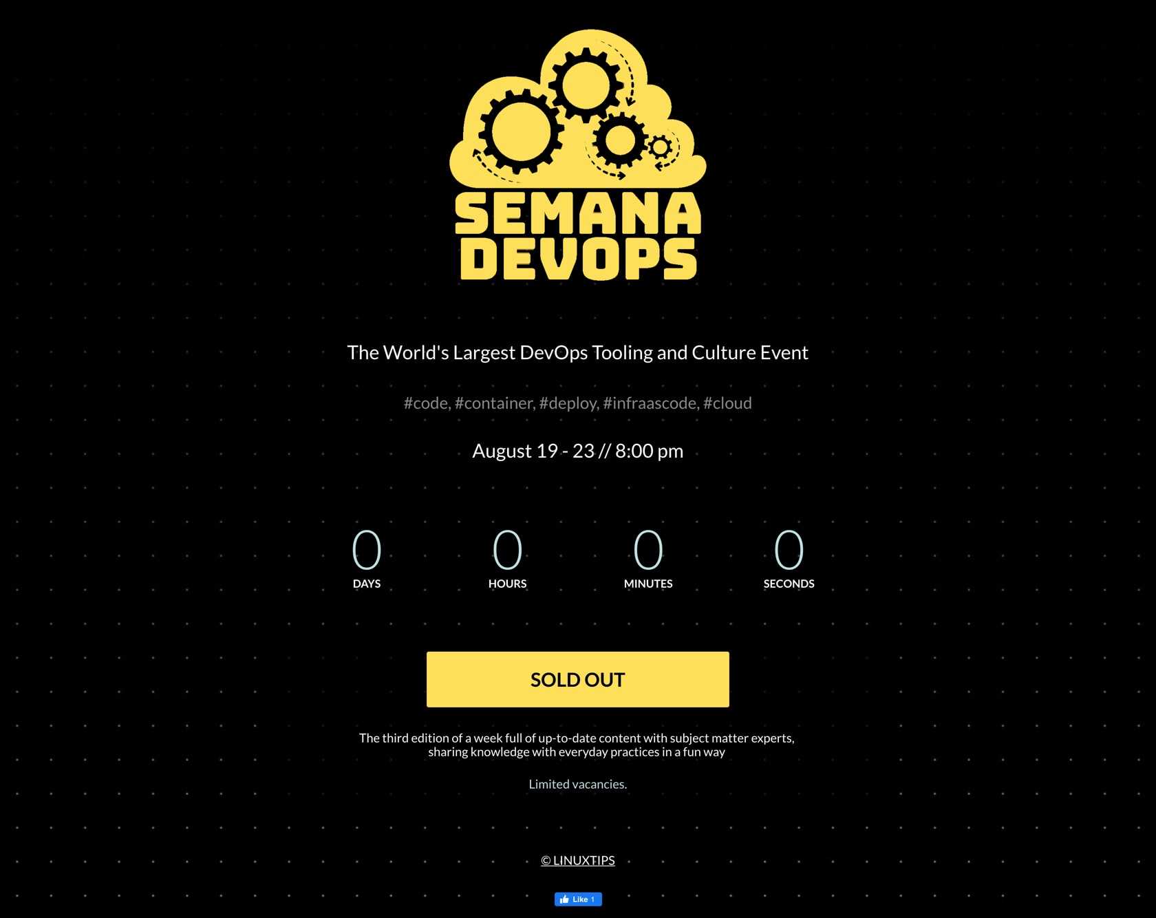
The big Semana Devops logo lets prospects know they’re registering an event from a big brand. The "less is more" design principle is optimized, which makes the landing page looks professional. A countdown timer encourages visitors to take action immediately. The CTA is placed at the center and has a good contrasting color compared with background color, so it’s easily noticed by visitors.
Remove the Facebook "like" button because it may cause visitors leave the page before registering the event. Make the price clear so visitors can understand whether they have to pay to join or not.
Sales Page Example from The BOD
Increasing purchases using a sales landing page
A sales landing page aims at turning visitors into converting customers. By creating this landing page, you can give prospects a convincing reason why your product will help them solve their problem, and so they have to get the product right now.
The "do you want..." subheadline is a great way to focus visitors’ attention and raise their curiosity. The form headline lets prospects know it’s nearly free (just $1) to join the challenge. Only 3 form fields are appropriate for a sales landing page, especially when they don’t ask for very personal information. Sales conversion optimization techniques such as countdown timer and social proof are made use of.
Change the color of the call to action (CTA) button to make it jump of the page. Also, the CTA copy could be more compelling.
Lead Generation Landing Page Example from The Luxe Lens
Using a free gift to attract visitors to opt in
Giving away free samples of your product is a good way to attract prospects and turn them into purchases customers. To leverage this offer, it’s a smart tactic to create a dedicated landing page for it.
The first call to action (CTA) button uses the first person, includes the word "free" and states the number of free presets that visitors will get after converting. Multiple cooperative CTA buttons also work well together. Showcase a video to guide visitors through how to use the presets, which is powerful to convince visitors. The sample set is explained with bullet points which makes it easier for visitors to scan and decide whether they should get it or not.
Use a countdown timer to set a limited time for the offer and urge visitors to act now. Show testimonials or reviews to establish trust with prospects.
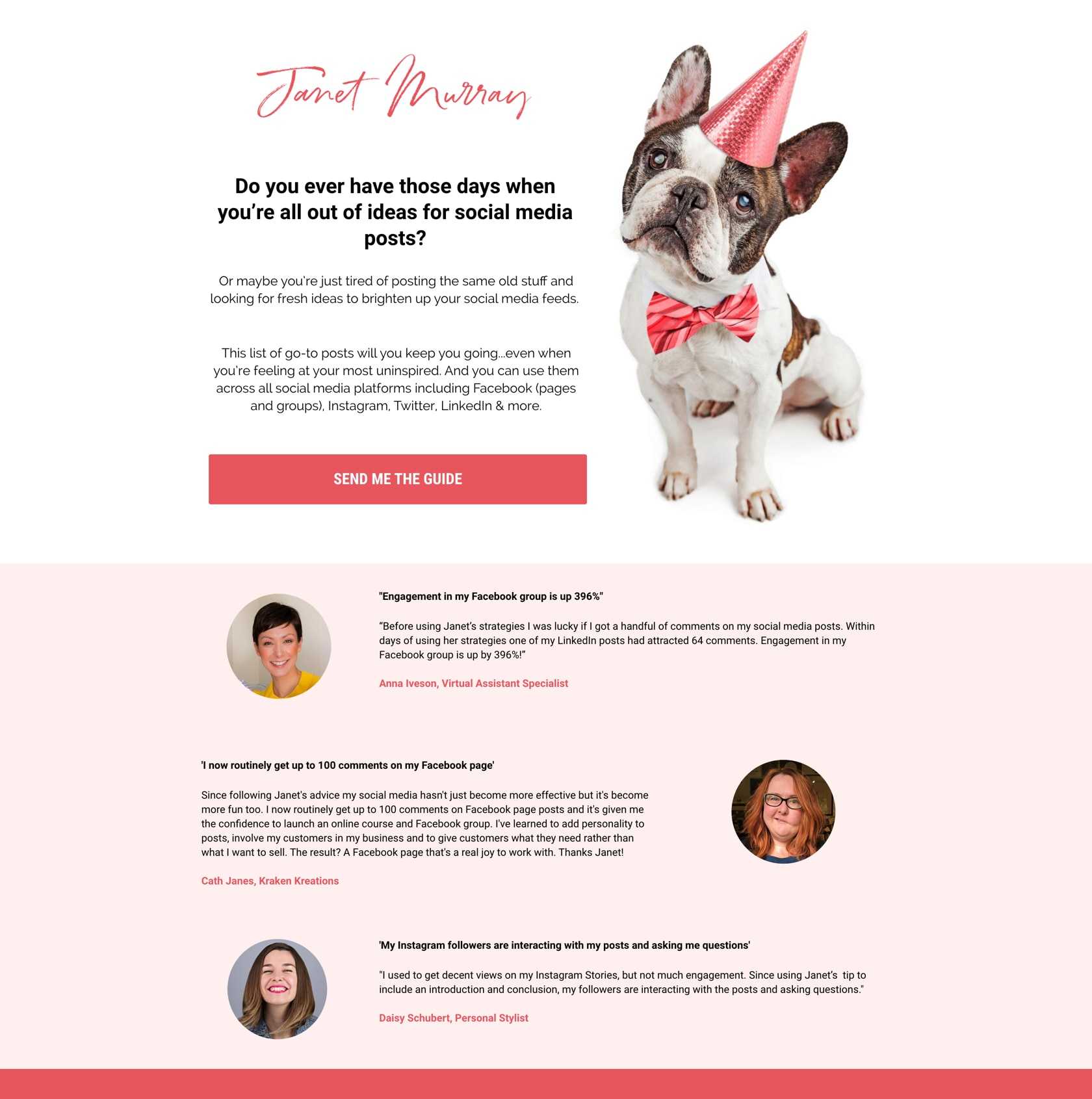
Lead Generation Landing Page Example from Janet Murray
Offering a free guide to collect qualified leads
Make a list of your ideas, turn them into a guide, and then create a dedicated landing page for it – you’ll have a very effective lead generation tool at your disposal. Such an effective way to generate qualified leads!
The call to action (CTA) button color contrasts with the white background, making it more visible to visitors. It also uses the first person to speak to prospects. Three reviews at the bottom of the page show pictures of the people who gave reviews and clarify how the product is useful to them. The question headline tells the pain point of visitors and triggers curiosity. The descriptive copy explains how the guide will help them solve that problem.
A/B test different colors for CTA button. Use the bullet points to show the benefits of the guide.
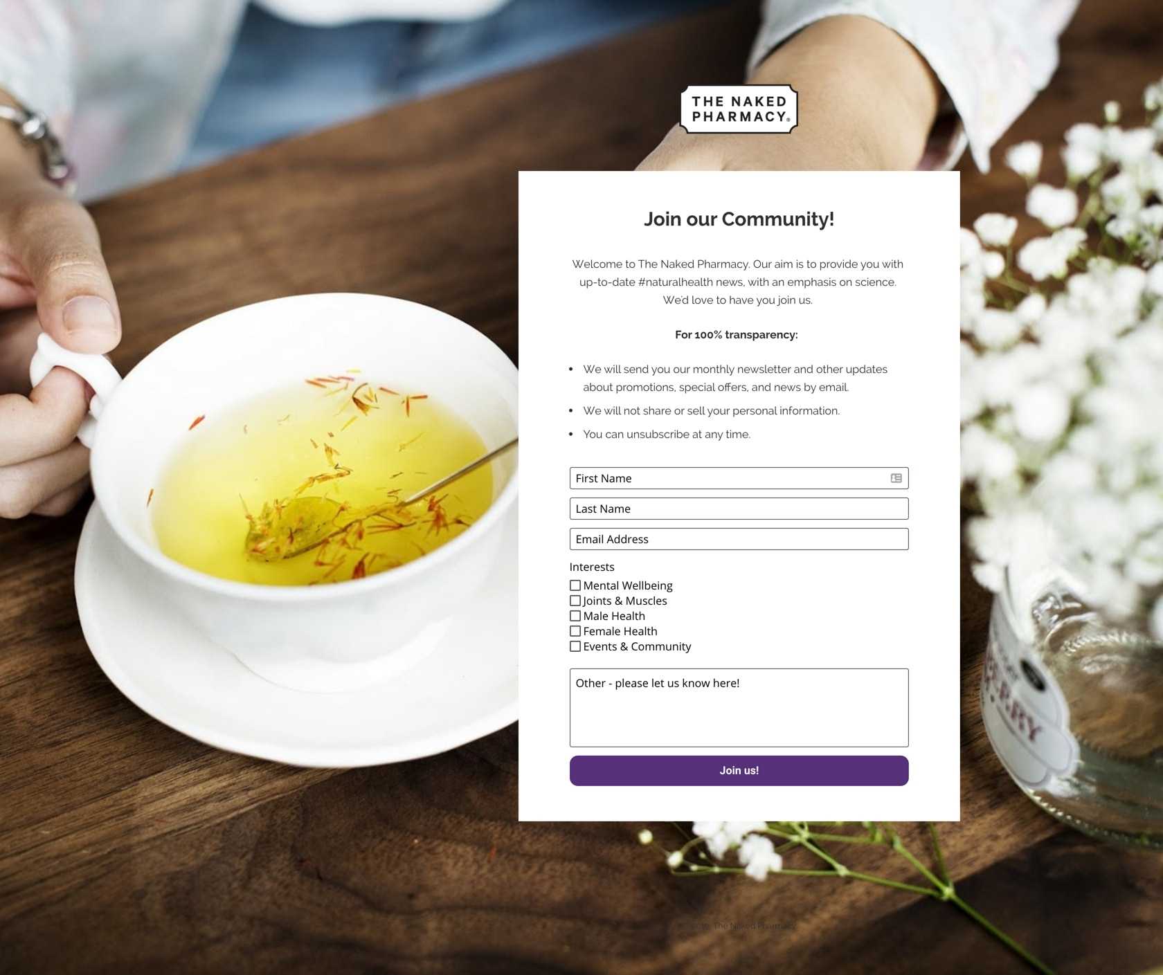
Lead Generation Landing Page Example from The Naked Pharmacy
Creating an online community to generate sales leads
A lead generation landing page is a great way to attract your potential customers. By designing a newsletter tailored to your product/ service, you’ll be able to gather their contact information to fill your sales pipeline.
The Naked Pharmacy logo at the top of the page immediately lets visitors know where they are. It’s a non-hyperlinked logo so it won’t allow visitors to leave the page, which is a plus. The headline is short and clear about what visitors should do. The copy uses bullet points to clarify what visitors will get, what they won’t get, and what if they can unsubscribe at any time. The call to action (CTA) button color is highly contrasting.
CTA copy should be more compelling. For example, add the number of members or subscribers to the CTA, such as "Join 10,000 members".
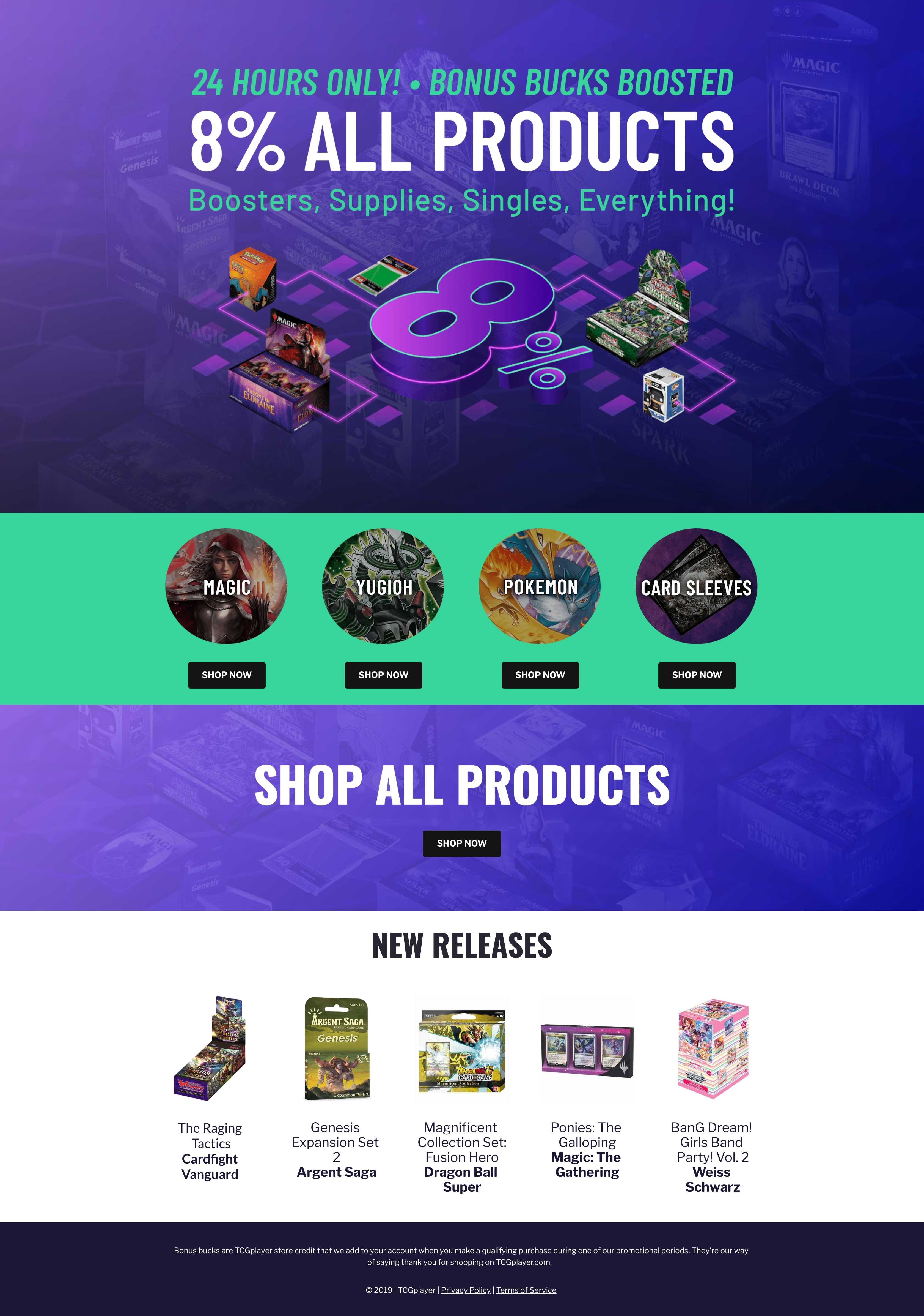
Product Discount Sales Page Example from TCG Player
Creating a high converting sales landing page to get more purchases
Sales landing pages provide you with an opportunity to promote your products to your audience in the most effective way possible. By using a long-form sales page and incorporating the appropriate techniques, you can explain your offer, build trust, and win more customers.
The headline and subheadline are strong and compelling. They work well together, making the offer convincing. The headline states "24 hours only", indicating this is a limited-time offer so visitors need to act now before the deal ends. The New Releases section gives potential customers quick updates about new products and encourages them to shop. Multiple call to action (CTA) buttons work together to convert visitors.
Change the color and size of CTAs to make them more visible. Add the logo of the brand/store to build trust with prospects. Change the word "24 hours only" to a countdown timer to increase the level of urgency.
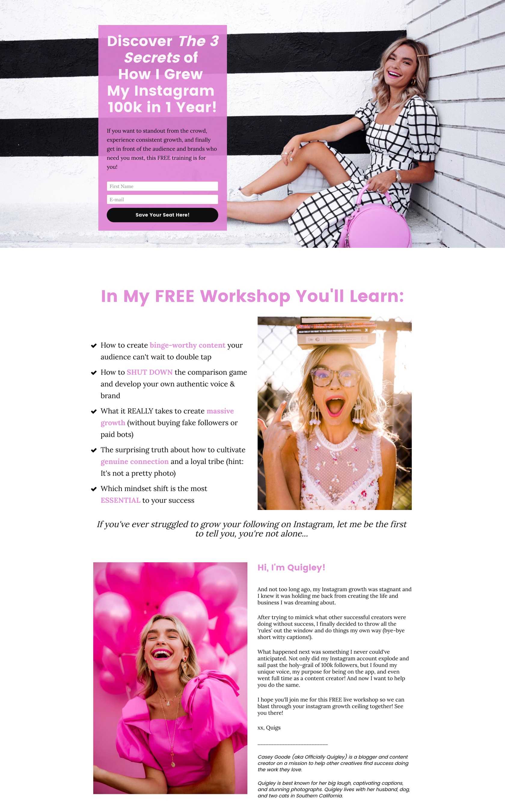
Webinar Landing Page Example from Officially Quigley
Giving away a free workshop to generate sales leads
Webinar landing pages are a great way to educate your customers, provide insight and collect more registrations. Take advantage of this technique to get more potential customers to register for your next event.
The headline is clear, which tells visitors what they’ll get after converting. Two form fields are great to convince visitors to opt in. They don’t ask for very personal information. The copy states the workshop is free to join and uses bullet points to explain the benefits. Information about the host lets visitors know who is holding the workshop, which helps establish credibility and builds trust.
Make the call to action (CTA) button more compelling by using the first person and changing the color. Using multiple CTAs can help convert more visitors. Include social proof to make the offer more convincing.
Want more landing page examples?
