What is A/B Testing And How Do I Use It?
A/B testing, also called split testing, is like a mini-experiment that helps you improve your conversion rate by helping you better understand what compels your audience to take action. Does your audience want a red or yellow CTA button? Do they click more when it’s $5 or 10% off their purchase? Do they want long-form or short-form content? Does a video make them more likely to convert?
It’s not about building a landing page from scrap. It’s about fine-tuning your campaign to ensure every single element on your page is optimized for conversion for your specific audience.
Landing page A/B testing helps you determine which factors of your page show the highest conversion rate.
The process is pretty simple. You publish multiple versions of the same page with one small difference, like a red CTA button and a yellow CTA button. You drive web traffic to each. You see which page has a higher conversion rate. Then you know which button color to use on your landing page.
So you change the CTA button to the winner (that shows a higher conversion rate), and then you start tests for another variable on the page.
This helps you understand exactly how to build a conversion-worthy page, while also recognizing patterns and learning about your target audience.
A/B testing definition
A/B testing lets you compare two versions of a landing page or webpage and then review the analytics to see which version performs better and which has a higher conversion rate. Once you’ve identified ‘the winner,’ you can direct all your traffic to only your highest performing content.
To get the best results, your A/B test should compare one variable at a time, such as a headline, color, font, image, or layout. (Multivariate testing, on the other hand, looks at multiple variables at once, but we don’t typically recommend this for our clients.)
Why do we do A/B testing?
A/B testing is about understanding your target audience. As we like to say, “guess less to grow more!”
It’s a strategy to understand your customer’s preferences and behaviors, so you can appeal to them in a way that promotes conversion.
How well do you know your target audience?
- What colors resonate the most with them?
- Do they like long-form or short-form pages?
- Do they prefer videos, pictures, or content?
- What kind of language and tone do they interact with?
- Do they prefer email, phone, or social media?
- Do they like dogs or cats?
If any of these questions left you feeling like you don’t know, then A/B testing is the perfect marketing tactic for you. It will help you answer these questions (or more relevant ones), so you can design your landing pages with your audience top of mind.
When you know what your audience wants, you can create a page optimized for conversion.
Single variable A/B testing
We almost always recommend that you test one variable at a time. If you change too many variables at once, you won’t know where any changes in engagement are coming from.
So, you want to create an A/B testing timeline and framework. Decide which variable you’ll change and for how long you’ll run the test. When the timeline is over, the “winning” page with the higher conversion rate stays. Then you use that page to test the next variable.
It’s like building a page brick by brick. It takes patience, but you’ll start to see your conversion rate ramp up in no time.
How to do A/B testing
Don’t go in with any assumptions. You’re running A/B testing because you want data about your lead, directly from your lead. Your assumptions might cloud your judgment, so listen to the numbers.
Here are the steps for running your A/B testing:
- Create a hypothesis. For example, “Red buttons will perform better than blue buttons.” (Don’t get attached to the outcome of the hypothesis.)
- Define two variations based on the hypothesis. For example, red vs blue.
- Divide incoming traffic. Don’t divide traffic forms, like your Adwords go to red and your social media go to blue, as this could skew the results. Try to split each traffic route in half.
- Run the test for a statistically significant time period. This could be anywhere from 2 weeks to 6 months.
- Find the winner with the higher conversion rate. Send all of your traffic there.
- Replace or delete the losing version.
- Repeat with a new variable.
Check out a more in-depth version of the A/B testing process.
How long to run an A/B test?
We recommend running a single test for at least two weeks, to make sure you have sufficient data to draw a conclusion. However, this will depend on your typical incoming traffic and the length of time you have to work with.
A/B testing examples
So which variables should you test? In this section, we’re going to give you a list of variables to test out, one by one, that can help make your page completely optimized for conversion.
1. Headlines
The headline is your first impression and your first chance to sell. It can intrigue people to read more or instantly send them away. It’s a make or break moment, so don’t be afraid to test and re-test to make sure you’re resonating with the largest possible audience.
Try out different lengths, characters, or phrasing. Try more emotional words, or rewrite it with a different tone. Add an exclamation point. Remove a word. Little changes can make a huge difference.
The goal of your headline is to inform of the benefits and to compel the viewer to take the next step (like make a purchase). In general, you want your headline to be:
- Succinct and clear
- Evocative and stimulating
- A representation of your main value proposition

2. Page layout/template
The layout of the page can make a huge difference in how your audience engages with the content. Test out different layouts to see how your visitor interacts with the information and CTA, based on where it is on the page.
Check out our easy-to-use, drag and drop builder templates builder templates to test out which page will show the greatest results for your business.
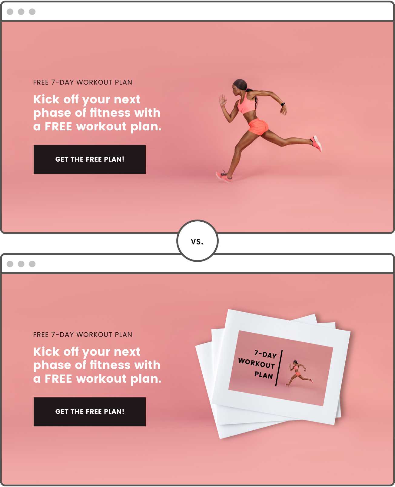
3. Background image
Images stimulate an emotional response and subconsciously send signals to your visitor. Try a stock image versus an illustration versus original photography to see which resonates with your audience. Test the difference between product photos, lifestyle images, or a “human” photo of your employees or customers.

4. Form fields
You want as little friction as possible at the conversion point. That means you may want to minimize the number of fields on your opt-in form, so the visitor can move faster through the conversion.
If you’re collecting leads, try to limit the form to just a first name and email/phone. You can always request more information from them later, but the primary goal now is to just get a means to contact them in the future.
If the conversion is a purchase, allow them to check out as a “guest” without creating an account. Then, let them create an account after the purchase has gone through, if they’d like.
Remember: you want fast and frictionless conversion.
5. Call to action (CTA) button
The CTA button is your salesperson that pulls the lead through to the next step.
- Is your CTA button the right color? Test out a red versus orange button.
- Does it use the right copy to compel people to click? See if using first-person language works better than third-person. Test if they prefer direct language or a goofy and pun-ny tone.
- Is the CTA positioned in an effective part of the page? Can they see it (and click on it) whenever they’re ready to convert?
A lot of our users see the biggest results after A/B testing and optimizing this button. This is the point where they’re converting, so you want to really emphasize optimization here.

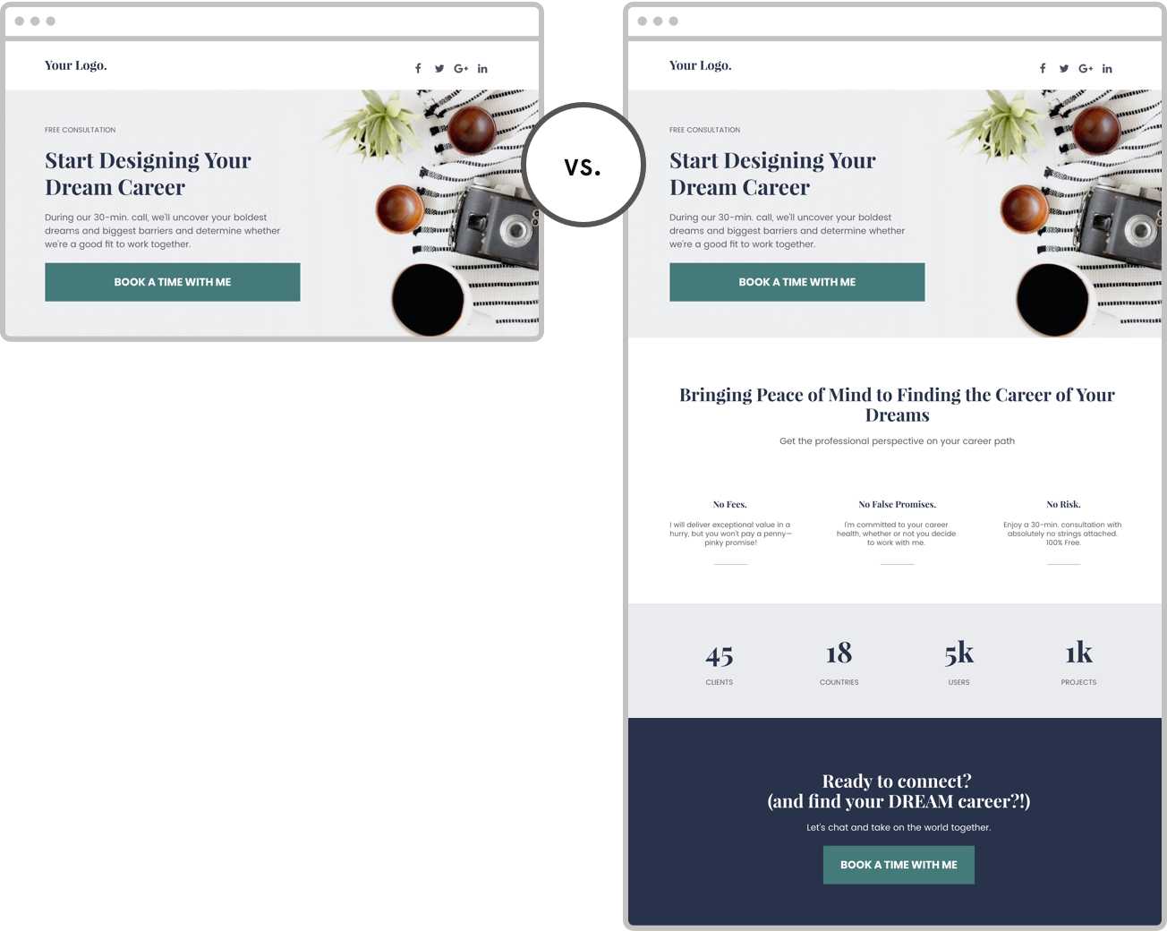
6. Density and length
Do you need a lot of words to explain your offering? Or do your visitors prefer short, sweet, and to the point? Try out different copy and content lengths to see what grabs your audience’s attention. You want to give them just enough information to be able to make the decision to convert.

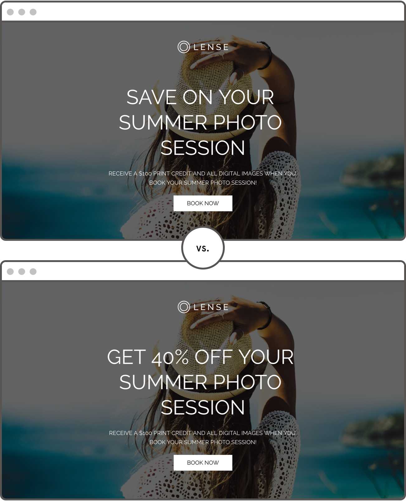
7. Numbers
The “numbers” on your page work the hardest to convince your visitor to convert. The more specific your numbers are, the better.
For example, “$100 off” might be more effective than “10% off purchase price,” but you won’t know until you test. Different audiences react to discounts, numbers, and statistics differently. So try out different ways of presenting your numbers to see what most resonates with your customer.
8. Testimonials
Customer reviews and endorsements increase the perceived value and credibility of your offerings. They also help customers envision their own lives after they’ve converted. Does the visitor see themselves in the people giving testimonials?
Not all landing pages need testimonials. In some cases, they might add noise and distract from the CTA. Run some A/B testing to see if testimonials are convincing people to convert or detracting from the main point.
If testimonials or reviews are too long, you can also consider adding links to your social media accounts (if you have a strong presence). This minimizes the friction on your page while adding in some social proof.
9. Offer
Sometimes it’s the actual offer or conversion action that’s deterring visitors. You might want to consider adjusting your price point, changing the time or day of your event, rewording the title of the book, or other adjustments of the lead magnet itself.
You can run A/B testing to see which kinds of offerings your customers want. But you should also ask them directly. How do they want to receive value from you, and what will they give in exchange for that value? Don’t be afraid to ask for feedback.
Also, consider the way your offering is presented. One of our Leadpages customers, Jae Jun at OldSchoolValue.com created two versions of his software and found that the more modern presentation had a 99.79% probability of outperforming the traditional looking package.
10. Progress Bar
Behavioral inertia is real. Once you have a visitor moving in any given direction—towards conversion or clicking away, they’re likely to keep moving that way… unless they run into an obstacle or distraction.
Showing them a progress bar is a great way to keep them moving forward. They’ll see that they’re almost done with the conversion, so they’ll keep at it until the end. We’ve seen progress bars dramatically increase the number of people who finish a conversion action.
How to do A/B testing
A/B testing is one of the best ways to understand your audience and improve your conversion rate. You don’t know what will work until you test it. The more testing you perform, the more intel you’ll collect about your audience, pages, leads, and customers, and the more successful you’re likely to be.
Unlimited A/B testing is available to Leadpages Pro and Advanced customers. It’s just five steps:
- On your Leadpages dashboard, click “Create new split test.’
- Find the page you want to run a split test for. Select it as your control.
- Add a variation by creating a copy of your control, or choose a page you’ve already built.
- Set the traffic distribution.
- Review and launch your test.
When you have your results, you can simply disable the non-winning page and direct all traffic to the winner.
In the next and final chapter of this guide, we’ll sum it all up with actionable steps you can take right now to optimize your page’s conversion rate and take your business to the next level.